
Design & digital marketing might seem like opposite fields, but there are certain similarities/learnings that can be applied in each one. Coming from a design background, and now specializing in paid media, I can say this is true.
Over time, I have realized that there are some valuable insights from design that can help you maximize your marketing plans and reports. One key thing I found valuable is incorporating the “The Principles of Design” into my digital marketing deliverables.
Applying these seven principles has proven to be instrumental for me when it comes to formatting slide decks. I know firsthand how extensive campaign planning and reporting decks can be, and if not presented efficiently and clearly, many questions can be left unanswered. While the information being shown is of utmost importance, it is also vital to show that information visually to ensure it is memorable for the viewer.
Reflecting on the advantages I gained, I am eager to share my experience with you, hoping these will prove to be beneficial for you as well.
What are the Principles of Design?
The principles of design are the building blocks for any design you create. Understanding the vital role these principles play when designing a slide deck is the key to making aesthetically balanced & informative presentations.
1. Emphasis
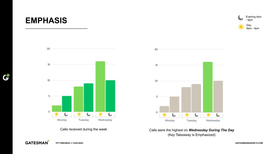
Emphasis is used to attract a viewer's attention to the focal point of an artwork. When making a slide deck, emphasis can be used when we want viewers to pay attention to one particular piece of information. This can be achieved through placement, contrast, color, size, etc.
For example, when using a bar chart to show information, it is easier for the reader if the key takeaway is emphasized. In the left chart, it's hard to pick out what's important. However, in the chart on the right, the important takeaway is emphasized, making it easier to see. Emphasis makes the most important information stand out.
2. Balance
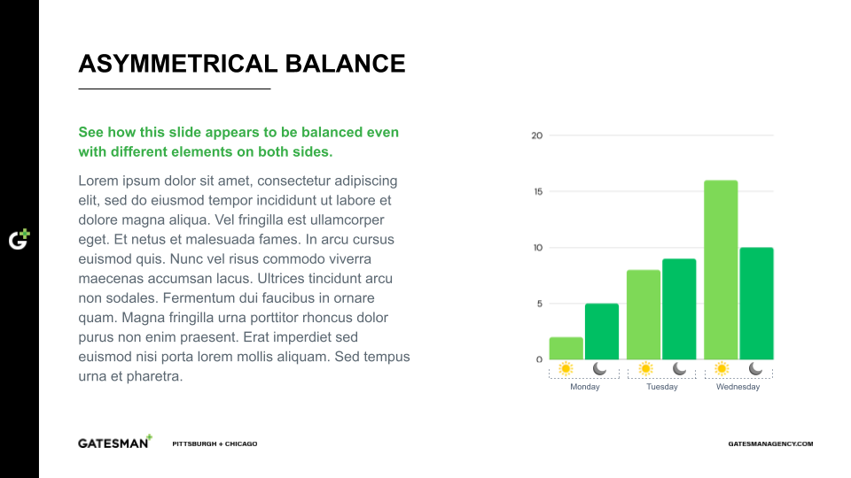
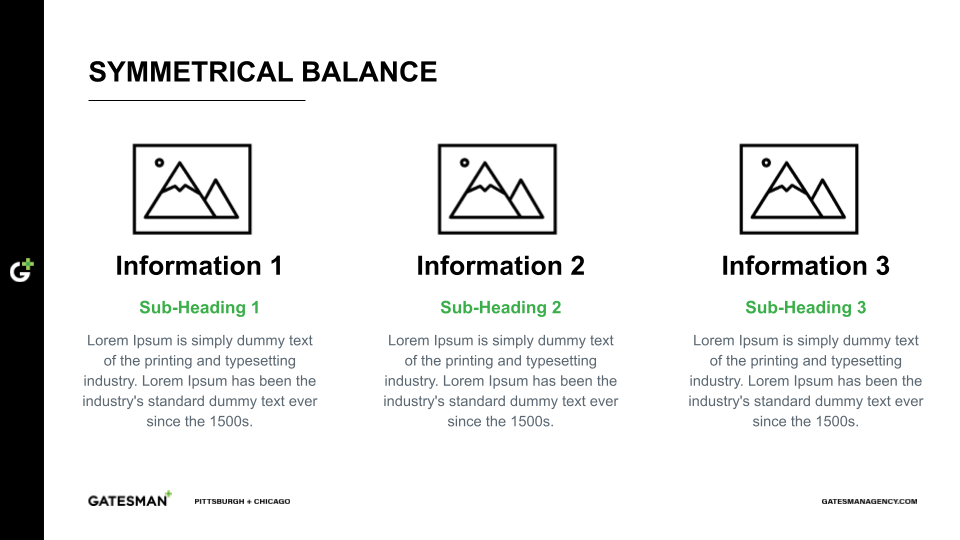
Balance is the distribution of the visual weight of objects, colors, texture, information and space. Balance can be created in a slide when the elements are arranged symmetrically or asymmetrically to create the impression of equality in the weight of those elements.
Asymmetrical balance is achieved when the two sides of a graphic are different but the whole design still looks complete. As seen below, the left side of the slide features text while the right features a chart, accomplishing that balance.
Symmetrical balance is achieved when the two sides of a graphic are similar in weight. As seen below, each section is balanced by equal arrangement, with each bullet of information including the same amount of content.
3. Contrast
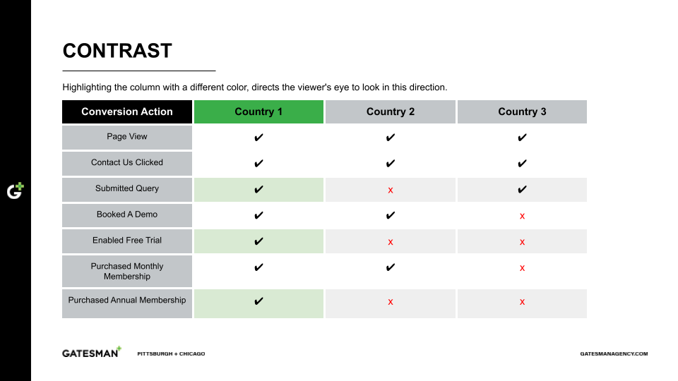
Contrast refers to the use of visually different elements like color, font choice, shapes, charts, graphic size, etc. Contrast can help add other principles of design to the same artwork as well. It can bring the viewer's eye to a focal point, guide them through the slide deck, and highlight vital information while adding variety and balance to the design.
In the chart below, contrast has been used by highlighting Country 1 in green to emphasize the information in that column.
4. Repetition
Repetition refers to the use of the same colors, font types, and font sizes throughout a design to reinforce an idea or a perception. This principle creates a pattern that builds unity and rhythm throughout the graphic.
As seen below, by using the same font types, colors and slide design, a sense of order is created and brand identity is reinforced. When designing a presentation, always make an effort to include the client’s brand identity (colors, fonts, etc.) throughout the deck to establish confidence in the information being presented.
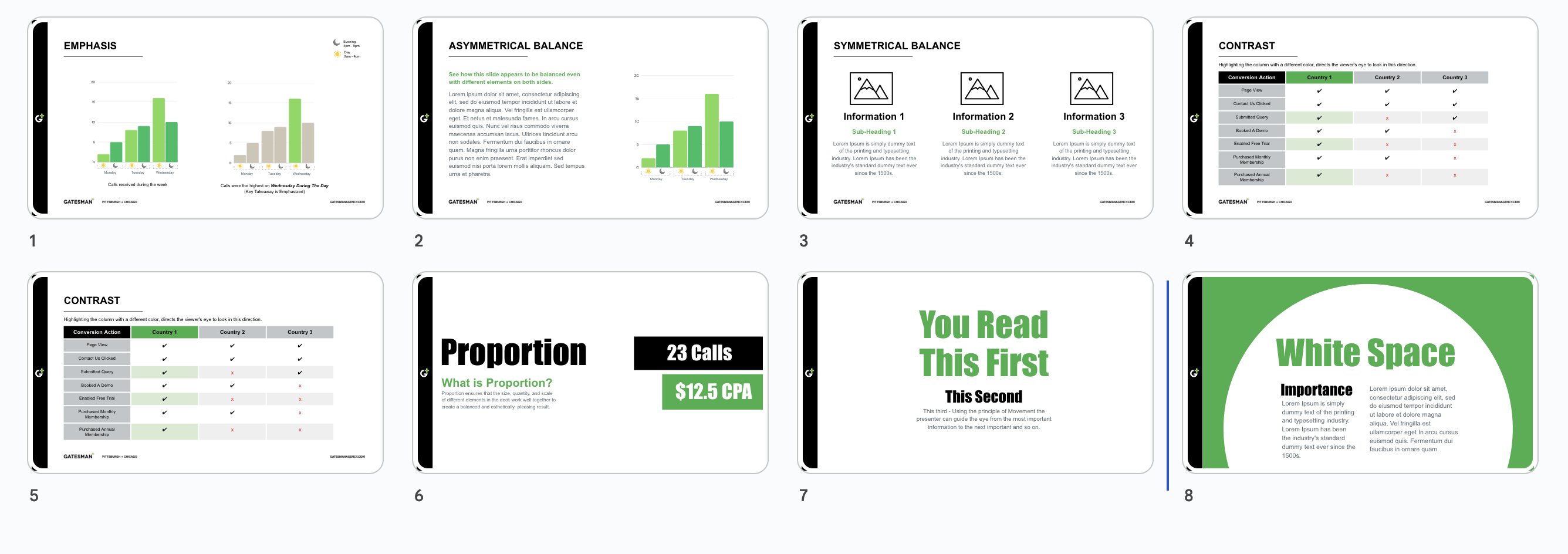
5. Proportion
Proportion as a design principle ensures that the size, quantity, and scale of different elements in a design work well together to create a balanced and aesthetically pleasing look.
In a slide, proportion can be used to call out the most important information. In the below slide, the viewer's attention first goes to the words “Proportion”, “23 Calls,” and “$12.5 CPA” before reading through the smaller details. This movement of the viewer's attention was obtained by the variation in the proportion of the font sizes.
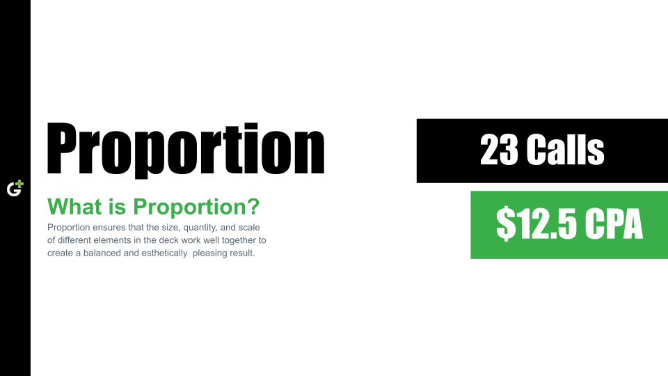
6. Movement
Movement refers to the way the viewer's eye travels over a design. Presenters can use this principle to guide the eye from the most important information to the next important piece. This can be created by using different principles of design in a balanced and harmonious way.
In the below slide, the information is presented in a way that shows how the viewer's eye moves in a particular pattern.
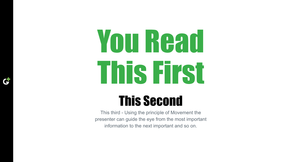
7. White Space
White space, also known as negative space, is the area that has no design elements like space between text, images and other elements on the design. Adding white space in a slide deck makes it easier on the eyes and keeps the reader from getting overwhelmed with too much information. This principle can improve the readability of content and contribute to increased comprehension. White space also helps a slide feel less cluttered, while ensuring other elements stand out.
In the below slide, white space has been used to group related information together. By adding a lot of white space between elements, the information is easier on the eyes and keeps the reader from getting overwhelmed.
Using these principles of design when making a report or plan can help a viewer more easily retain the information you are presenting, and easy-to-understand data can lead to quicker decisions by your clients.
Go ahead and download the free template (as seen above) for these principles and make your own versions. Have any lingering questions? Feel free to connect with me on LinkedIn so we can chat more about design in digital marketing.


